Tesla Wrap Design Ideas: Racing Stripes, Color Palettes and AI Prompts
Explore Tesla digital-wrap design ideas for Model 3 and Model Y, with practical color palettes, AI prompt examples and panel-placement tips.
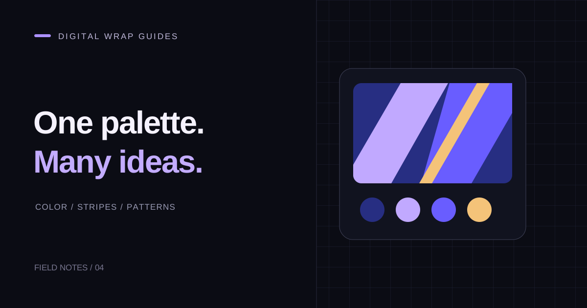
The strongest Tesla wrap design ideas usually have a clear visual rule. A stripe has a direction, a color palette has a hierarchy, and a pattern has a repeat size. You can explore many styles without adding more detail to every body panel. Start with the feature you want to emphasize, then let the rest of the design support it.
These ideas are for digital vehicle visuals, not specifications for a physical vinyl installation. Open the editor with the correct Model 3 or Model Y template and use the examples as starting briefs.
Quiet color blocking
Use a muted base with one restrained accent: graphite and pale blue, navy and warm cream, or forest green and silver. Put the accent on a limited area so the main color remains recognizable from a small preview.
Try this prompt: “A clean vehicle wrap with a deep navy base, warm cream accent panels, broad simple shapes, balanced contrast, no lettering.” After generation, compare the hood and door colors. If the result contains too many unrelated shades, simplify your next prompt rather than adding more instructions about individual pixels.
Motorsport-inspired stripes
A racing look works best when the stripes have a consistent thickness and purpose. Decide whether they run along the center, lower sides, or diagonal sections before choosing the colors. Leave enough uninterrupted body color around them.
Prompt idea: “A white and cobalt blue motorsport-inspired vehicle wrap, one bold red accent stripe, clean geometric sections, minimal visual clutter, no logos or sponsor text.” Avoid assuming a generated stripe will connect perfectly between panels. Check and adjust its sections in the flat layout and available preview.
Retro gradients
A gradient can carry the whole composition. Use two or three related colors and choose a direction, such as a warm nose fading into a cool rear. Keep text and small emblems out of the first version so you can assess the transition.
Prompt idea: “A retro vehicle wrap with a sunset orange to coral gradient, soft transitions, a subtle dark lower edge, simple large color regions, no text.” Look for unwanted color jumps at separate panels. A successful flat gradient may need placement changes when it appears across the body.
Playful geometric patterns
Try large angular blocks, a limited camouflage palette, or a repeated line motif. Repetition gives the design structure; variation keeps it interesting. Use a repeat size that remains visible in the small vehicle visualization.
Prompt idea: “A playful geometric vehicle wrap with large teal, violet and charcoal shapes, a consistent three-color palette, crisp edges, no lettering.” If the pattern becomes noisy, enlarge the shapes and remove one color. That is often more useful than generating an even more complicated variation.
Reference images need a defined role
When working from a reference image, decide whether you want its palette, composition, or pattern language. Asking for everything can produce an unfocused result. Use artwork you own or have permission to reuse, particularly if you intend to publish your design in the gallery.
For vehicle preparation, follow the template guide. Tesla's official instructions require the matching template and artwork in the white areas. Supported import features vary by vehicle software and availability.
Review before spending more credits
Save the variations you like, then compare one feature at a time: palette, stripe position, or pattern scale. The pricing page lists credit packs, but a better prompt and a small manual adjustment can be more useful than repeated generation.
Use the quick-start guide for the editing workflow and the digital-wrap introduction for export planning. When a design is ready, follow the phone and USB import guide and check its actual in-car appearance.